Pinecrest Medical Center is a new community hospital in Oakland County, Michigan built to serve its growing community. From the start, the challenge was to design a brand identity that would establish trust, communicate professionalism, and feel approachable to patients and families. The branding positions Pinecrest as more than a healthcare facility — it’s a place where compassion, clarity, and community come together.

The Pinecrest logo combines a pine tree and a medical cross, symbolizing growth, healing, and compassion. The serif “Pinecrest” conveys trust, while the heart-dotted “i” adds warmth. Paired with the sans-serif “Medical Center,” the logo feels both professional and welcoming — a balance of care and clarity.

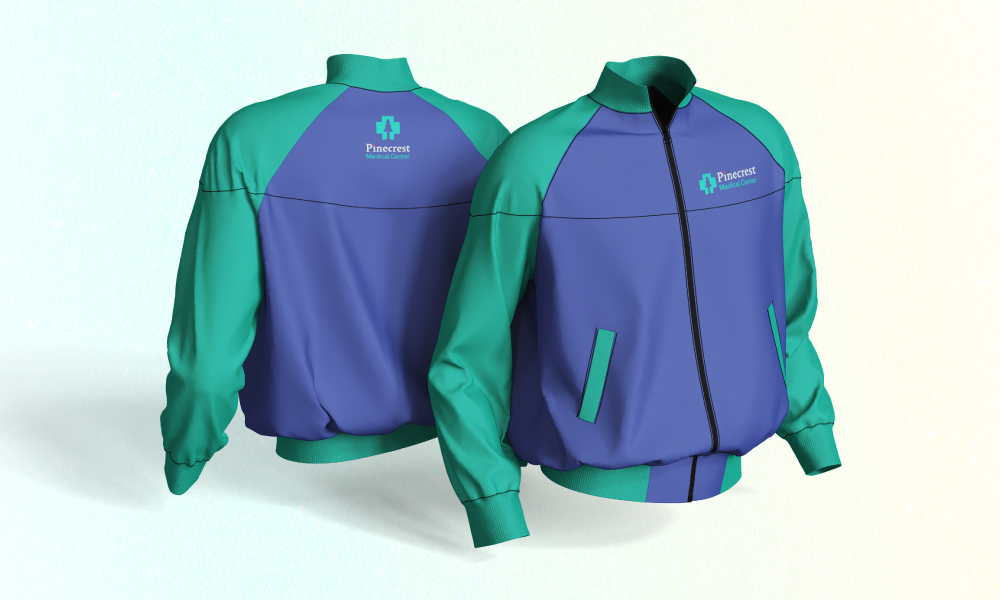
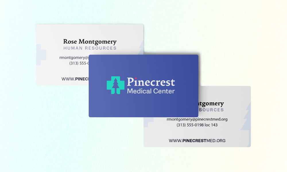
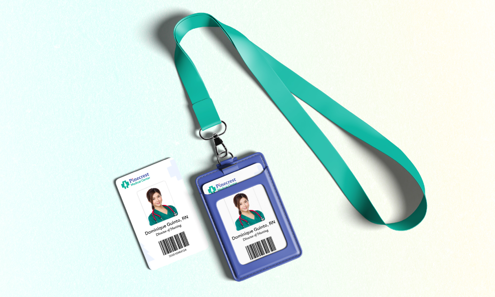
Pinecrest’s color palette blends trust and warmth to reflect both professionalism and compassion. The main colors — a calming teal #0eb098 and confident blue #4253a6 — establish stability and care. Secondary tones like soft blues, peach, and yellow (#91b2eb, #4d87c9, #ffbaba, #fff3a6) bring approachability and optimism. Accent hues of orange and rose (#e8922f, #d43967) add energy and human warmth, while neutral black and grey support legibility across all materials.

Pinecrest’s brand system was designed to be clear, consistent, and practical — adaptable to both professional and everyday settings. From stationery to staff apparel, each item reflects the hospital’s warm and trustworthy personality.

Whenever I design a logo, I also create a stylescape to show how the brand works in real life. For Pinecrest, it brings together the logo, colors, fonts, and imagery to define its visual personality — where professionalism meets warmth.

Working on Pinecrest taught me that good design feels like care. If you’d like help bringing that feeling to your own brand, reach out — I’d love to hear your story.

pinecrestMedicalCenter-logo-vertical

Like this post?

Sign up for my infrequent newsletters for post updates


Scroll to Top