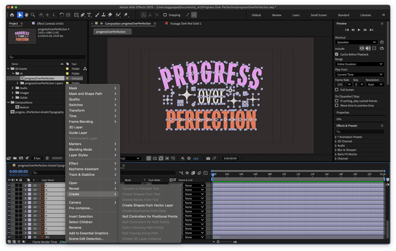
Progress isn’t always about getting everything right the first time—it’s about showing up, trying, and learning along the way. That’s the idea behind my latest kinetic typography experiment, Progress Over Perfection, where I animated each letter in After Effects as a reminder that creativity is built step by step.
I designed the text layout and star graphics in Adobe Illustrator using the font Peridot PE Variable. The stars were made with the Pucker & Bloat effect (Effects > Distort & Transform). To prep for After Effects, I separated each letter into its own layer by selecting the main layer, opening the Layers panel menu, and choosing Release to Layers (Sequence). Then I named each layer (because we always name our layers).
I imported the .ai file into After Effects as Composition – Retain Layer Sizes to keep everything aligned with my 1920×1080 comp. Then I converted the vector layers to shapes, making the animation smoother and the render faster.
Then I brought the design to life—animating every letter, star, circle, and the background using techniques I picked up from Holmes Motion and Ben Marriott.
This project was a reminder that design doesn’t have to be perfect to be meaningful. Every letter, star, and keyframe came together step by step—proof that progress really is more powerful than perfection.
Like this post?
Sign up for my infrequent newsletters for post updates