When the team at Sangkap Station reached out for a rebrand, I was genuinely excited. It’s not every day you get to help reshape the identity of a business that’s already so well-loved. They had a clear sense of who they are, who they serve, and what makes them special—and that made the whole process a real joy.
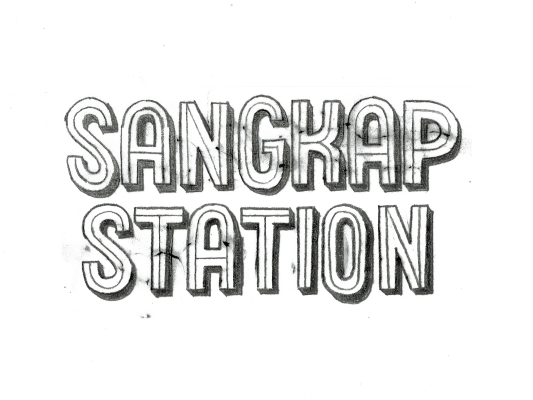
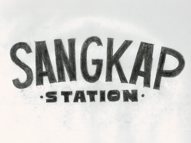
I like to kick off branding by choosing a few key words to guide the design. For Sangkap Station, our top three were: practical, family-friendly and down-to-earth. From there, I got to work on some sketches, and together we narrowed it down to three favorites.
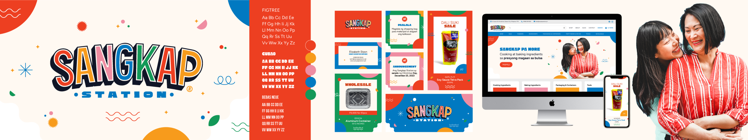
After a bit of back-and-forth on tweaks, we landed on the sketch you see above. “Sangkap” blends elements of the Proxima Nova and Bebas Neue fonts, while “Station” uses the Cubao font by Aaron Amar. A final note was to add depth to “Sangkap.”
I design all my logos as vector files, so they stay sharp and clear no matter the size—whether it’s on a tiny business card or a giant billboard.
Whenever I create a logo, I also put together a stylescape to go with it. This helps us see how the branding works in different situations. It’s where we define the brand’s visual personality—bringing together the logo, colors, fonts, imagery, graphics and real-life applications.
I’m so happy with how this project turned out. Are you thinking about creating your own brand? Let’s chat!
Like this post?
Sign up for my infrequent newsletters for post updates